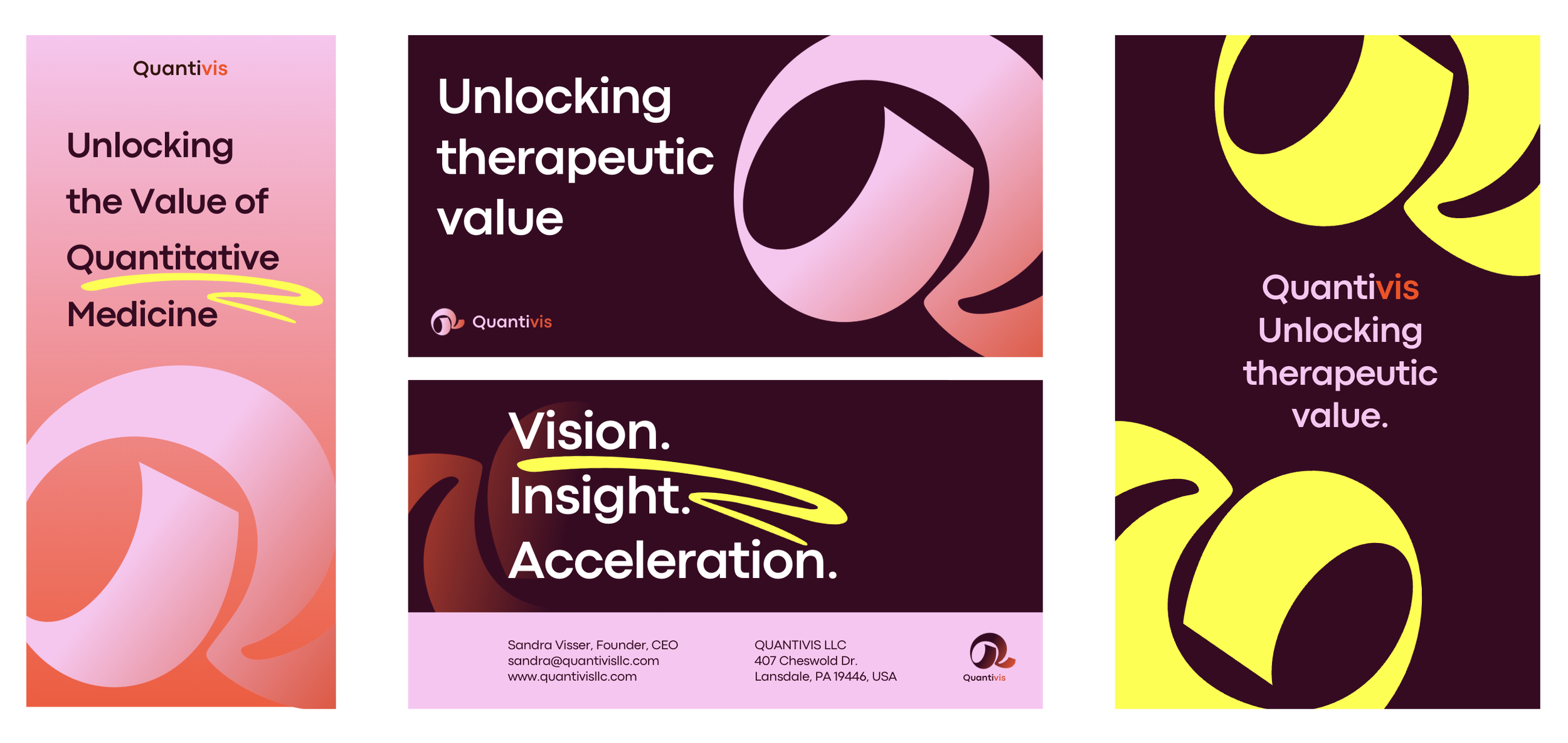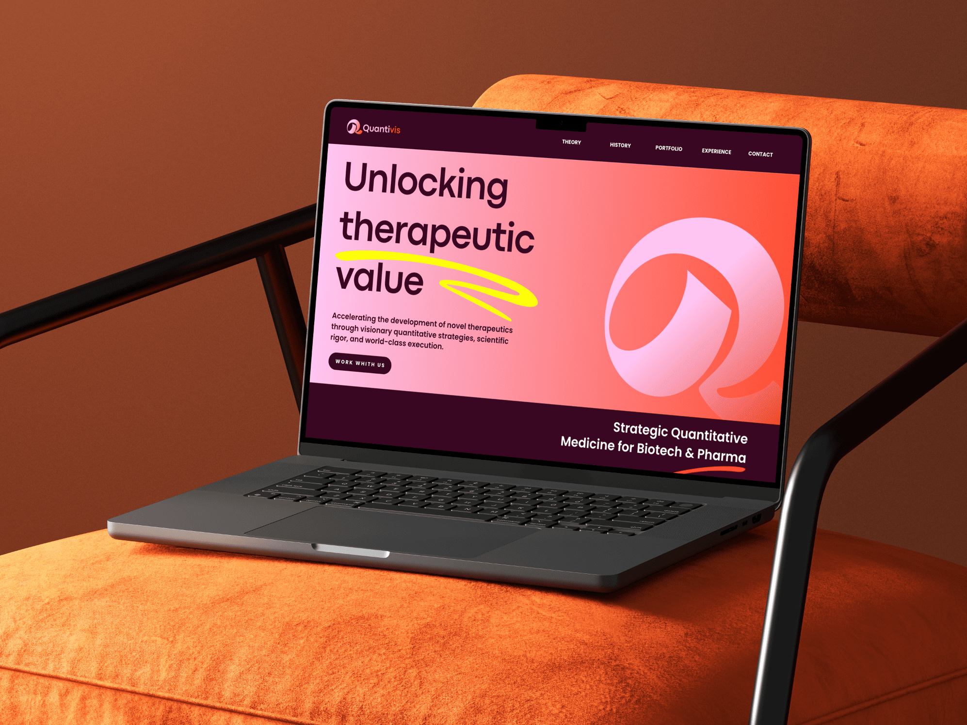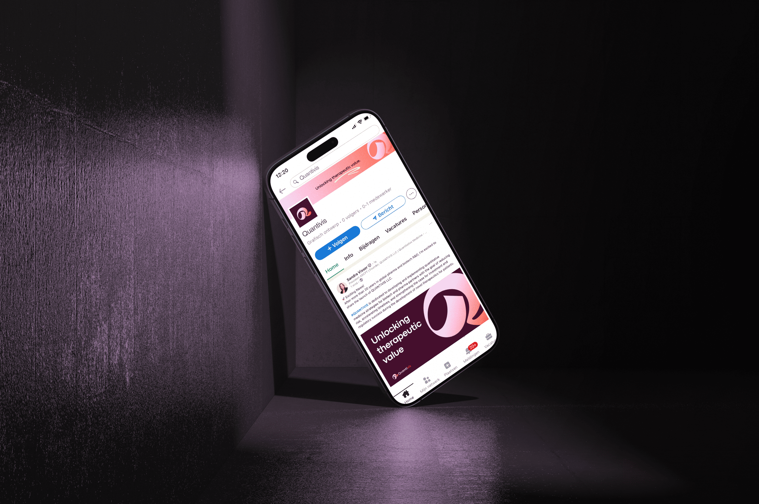
Brand Identity for Quantivis
a distinctive and modern design system.
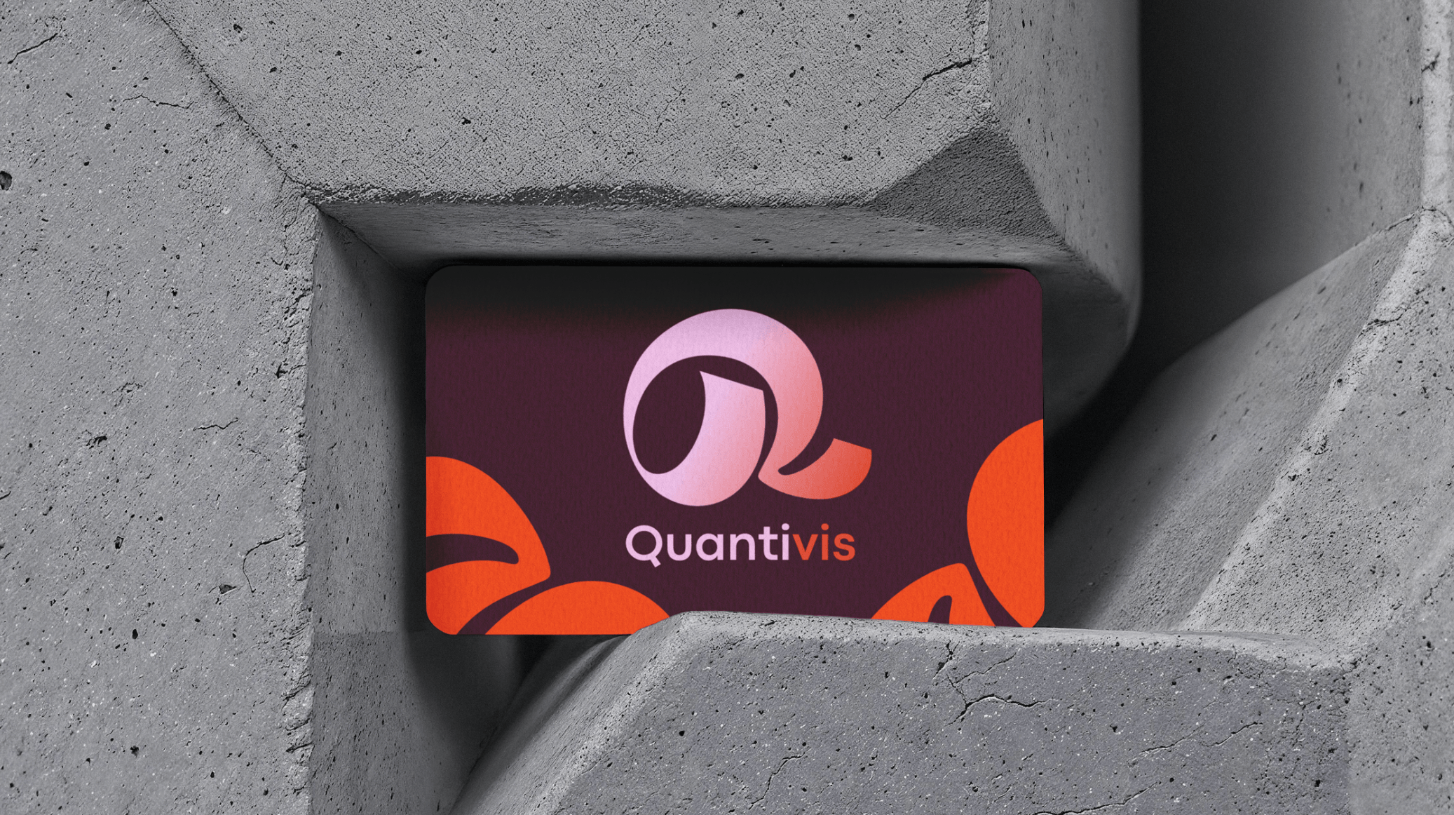
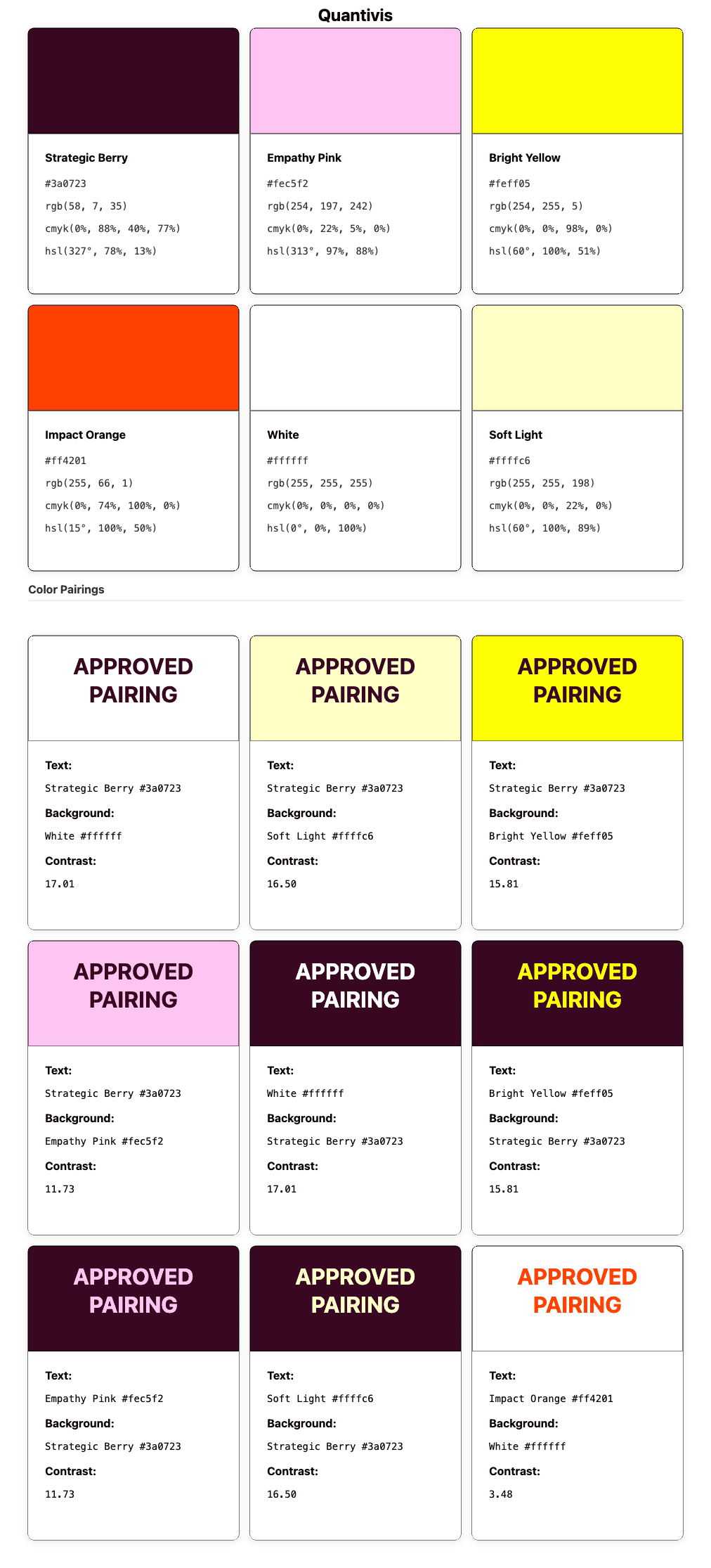
Logo and branding
Quantivis is a strategic consultancy in quantitative medicine, helping biotech and pharma companies make smarter, data-driven decisions in drug development.
I designed a complete visual identity for the brand, including the logo, color palette and typography. The goal was to translate Quantivis’ core values vision, scientific precision and human collaboration into a modern, distinctive identity that stands out in the biotech landscape.
-
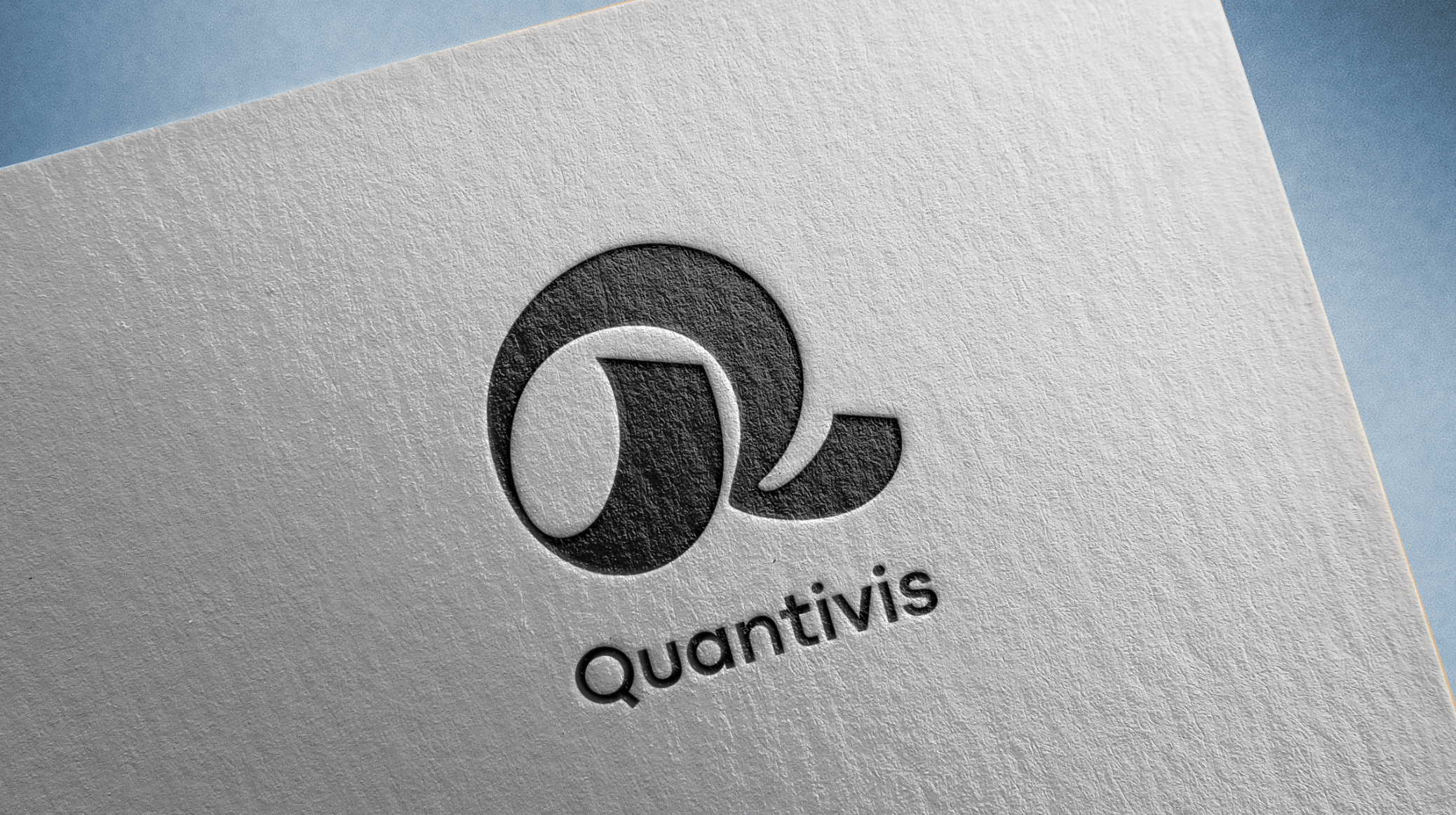
Letter Q & V
The logo is built from the letters Q and V, referencing the name Quantivis. By merging the two letters into a single form, the mark visually represents the connection between quantitative analysis and vision, the core principles of the brand.
-

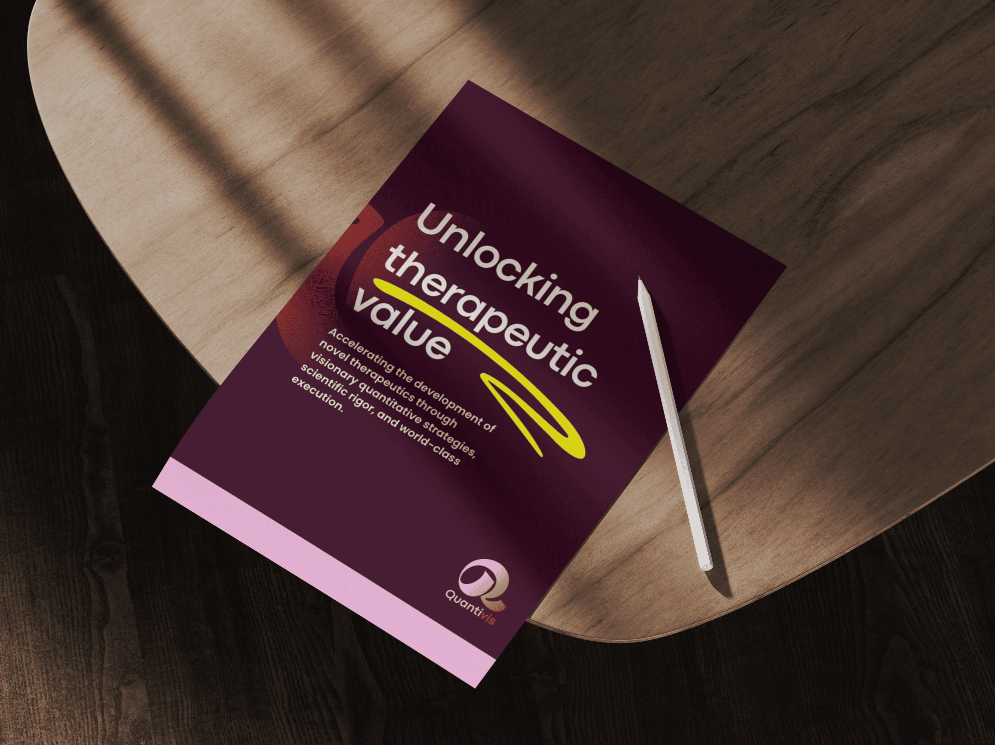
Smile line
A subtle smile line is integrated into the shape of the logo. This element adds a human and approachable touch, symbolizing optimism, collaboration and positive partnerships in scientific innovation.
-
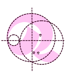
Balanced asymmetric form
Although the shape appears organic and asymmetrical, it is carefully constructed from multiple circles. This balance reflects adaptability, precision and structured flexibility, qualities essential in data-driven research and strategic decision-making.
-

Magnifying glass
The form also resembles a magnifying glass, representing research, investigation and discovery. It reflects the role of Quantivis in analyzing complex data and translating insights into clear strategic direction.
-

Question mark
When rotated, the mark subtly evokes a question mark, symbolizing curiosity and critical thinking. It represents the strategic questions in drug development that Quantivis helps answer through quantitative medicine and scientific insight.